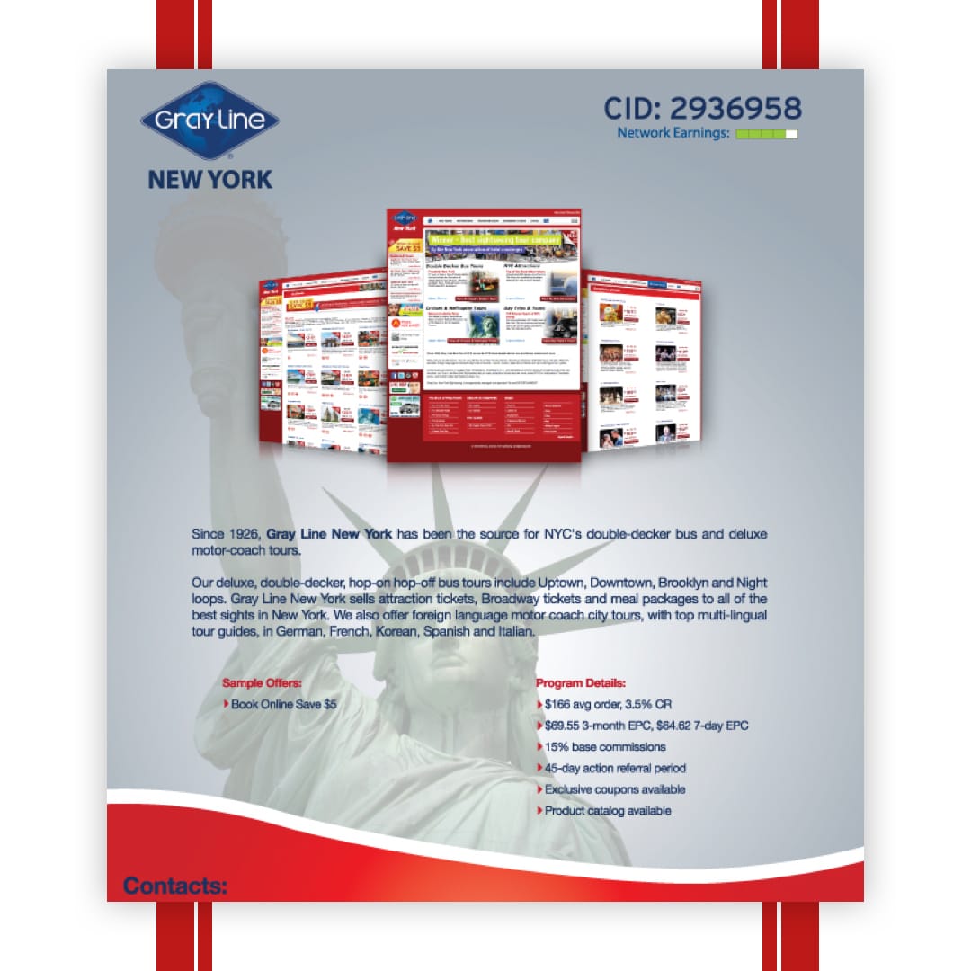
Gray Line NY
Improved the user flow and overall shopping experience for a carpet retailer by creating a responsive e-commerce platform that prioritized intuitive navigation, visual clarity, and conversion-focused UX. Integrated secure payment systems, rich product imagery, and smart filtering to streamline product discovery. The project was driven by the goal of increasing customer engagement, boosting online sales, and establishing a strong, modern digital presence in a highly competitive retail market.
Creative, talented, patient, efficient and an absolute team player. Ehab has a friendly demeanor that together with his abilities and skills are great assets for any company.
The Challenge
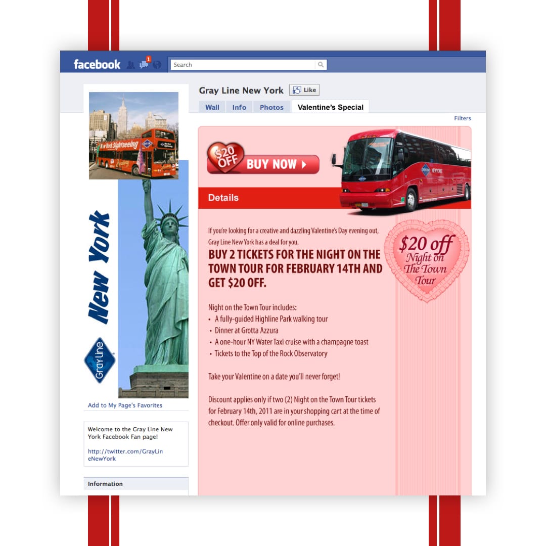
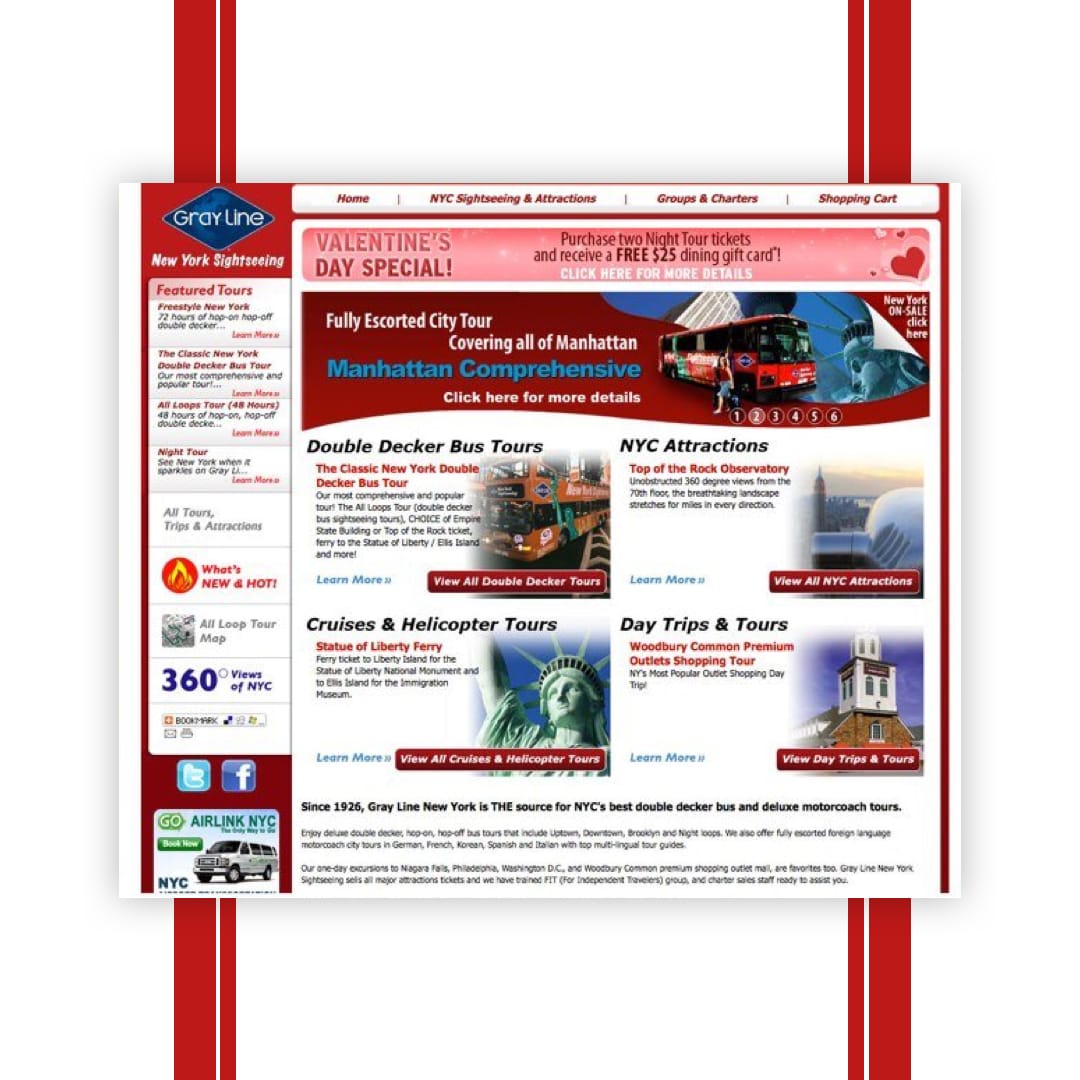
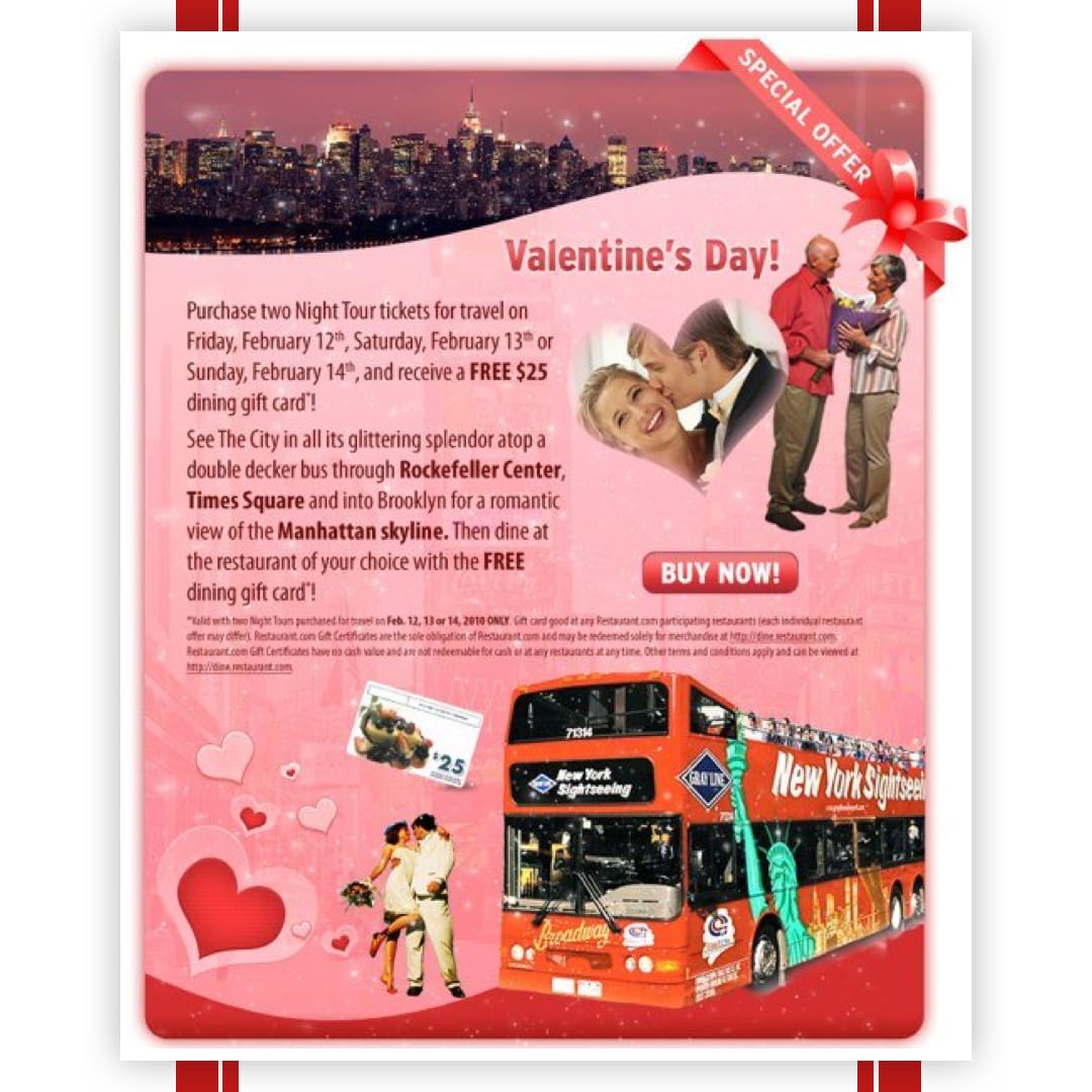
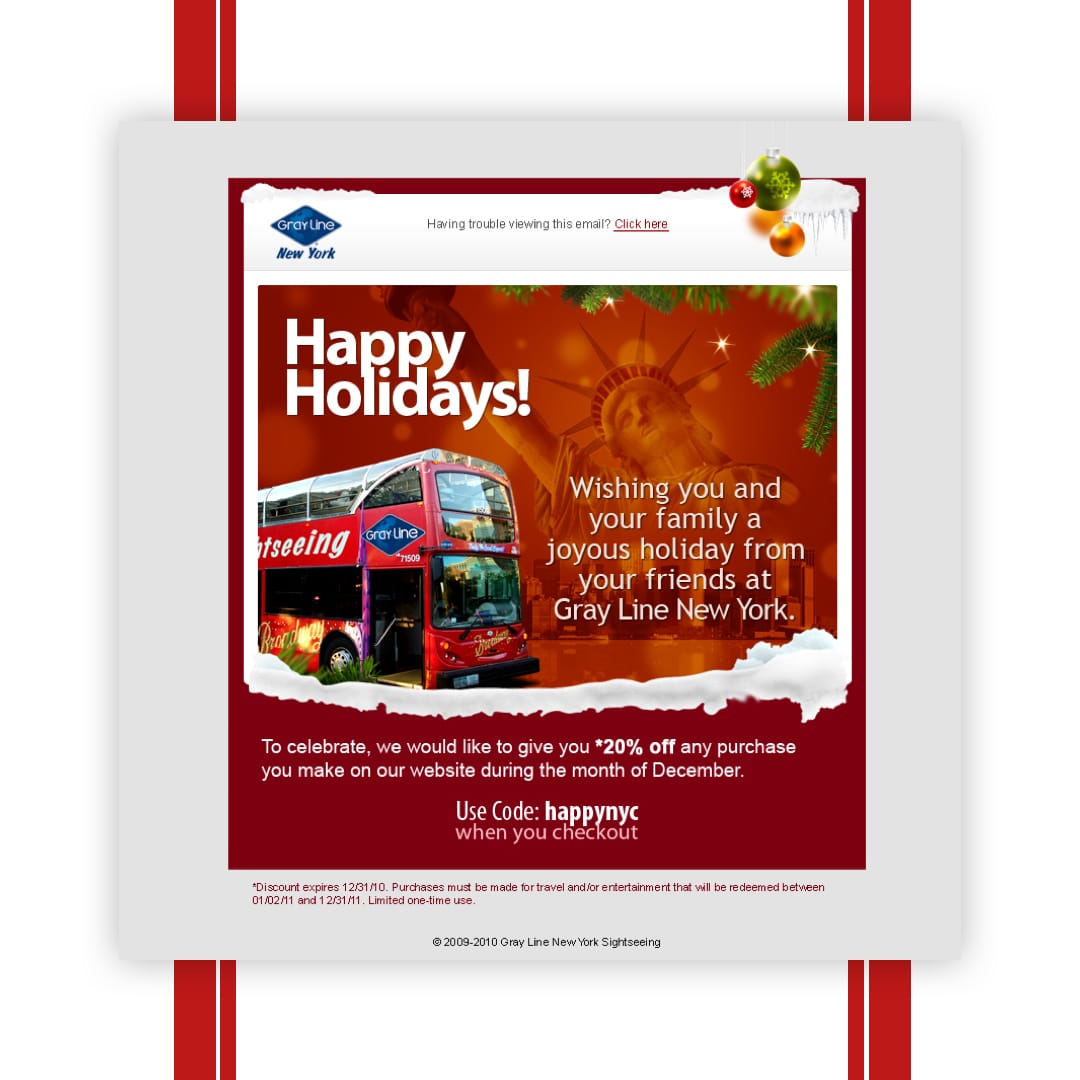
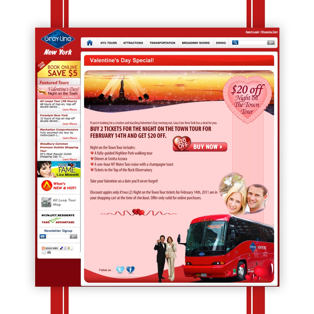
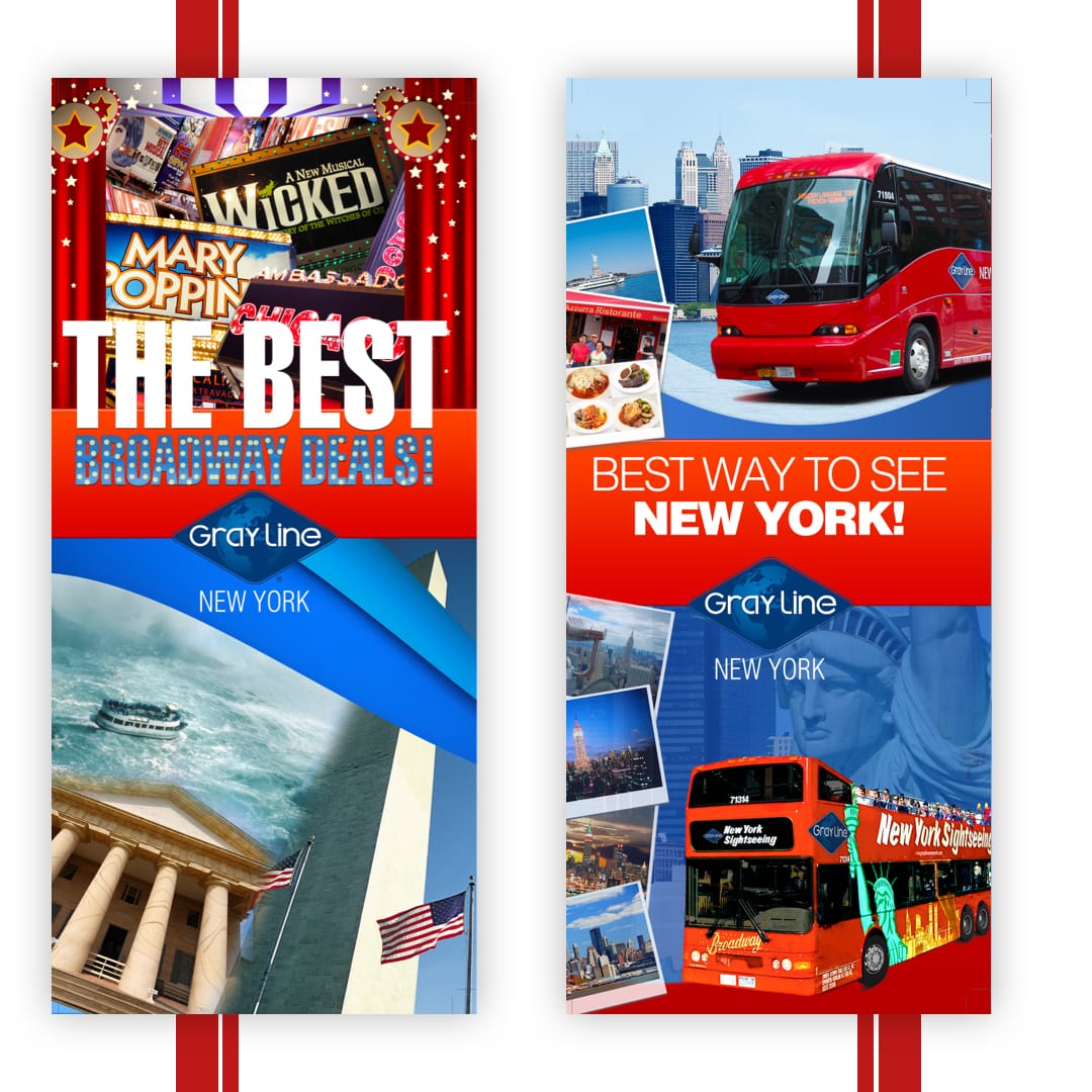
Gray Line New York, a prominent sightseeing tour operator, aimed to revamp its online presence to better serve tourists and locals seeking tour experiences. The existing website faced challenges in user navigation, outdated design aesthetics, and a cumbersome booking process, leading to decreased online sales and user engagement.
Discovery & Research
User Pain Points Identified:
- Complicated navigation hindering tour discovery.
- Lengthy and confusing booking process.
- Non-responsive design affecting mobile users.
Research Activities:
- Conducted user interviews to understand booking behaviors.
- Analyzed website analytics to identify drop-off points.
- Reviewed competitor websites for best practices in tour booking experiences.
Ideation & Iteration
Concept Development:
- Developed wireframes focusing on streamlined navigation and simplified booking flows.
- Created prototypes to test new layouts and gather user feedback.
Design Decisions:
- Implemented a modular design system to accommodate various tour categories.
- Introduced high-quality imagery and detailed tour descriptions to enhance storytelling.
- Optimized the checkout process to reduce friction and improve conversion rates.
Visual Design & Systems
Typography & Color:
- Selected clean, sans-serif fonts for readability and modern appeal.
- Utilized a vibrant color palette to reflect the energy of New York City and draw user attention to key actions.
Layout Logic:
- Adopted a grid-based layout to ensure consistency and scalability across devices.
- Prioritized mobile responsiveness to cater to a broader audience.
Visual Tone:
- Balanced professional aesthetics with engaging visuals to appeal to both tourists and locals.
Outcome & Reflection
Outcome:
- Launched a responsive e-commerce platform that significantly improved user engagement.
- Enhanced tour discovery through intuitive navigation and personalized recommendations.
- Received positive feedback from stakeholders and customers, noting the seamless blend of design and functionality.
Reflection:
This project underscored the importance of aligning digital design with user expectations and business objectives. By focusing on user-centric design principles and iterative testing, I was able to create an online experience that not only met business goals but also provided a seamless booking experience for users.
Ready to start a project?
I’d love to hear more. Tell me a bit about yourself, and I’ll be in touch with you shortly.
More projects


