JWed & JWed Match
Improved user engagement and retention for a Jewish dating platform by redesigning mobile app interfaces and optimizing email marketing strategy. Focused on streamlining onboarding, enhancing user flow, and aligning UI with user behavior patterns. Developed targeted, data-driven email campaigns and in-app messaging to drive conversions, boost sign-ups, and foster long-term engagement.
I had the pleasure of working with Ehab at JWed, where he served as a graphic designer. Ehab consistently impressed me with his attentive listening skills and his willingness to tackle any challenge head-on. Throughout his tenure, Ehab never hesitated to take on new projects and consistently delivered high-quality results promptly. His ability to understand and translate concepts into visually compelling designs was remarkable. Ehab's collaborative approach and his commitment to excellence made him a valuable asset to our team. I highly recommend Ehab to anyone seeking a dedicated and talented graphic designer who excels in delivering creative solutions efficiently.
The Challenge
JWed, a Jewish dating platform, sought to enhance user engagement and retention across its mobile application and email communications. The goal was to create a seamless user experience that aligns with the platform’s mission of facilitating meaningful connections among Jewish singles.
Discovery & Research
User Pain Points Identified:
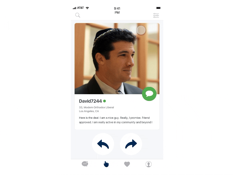
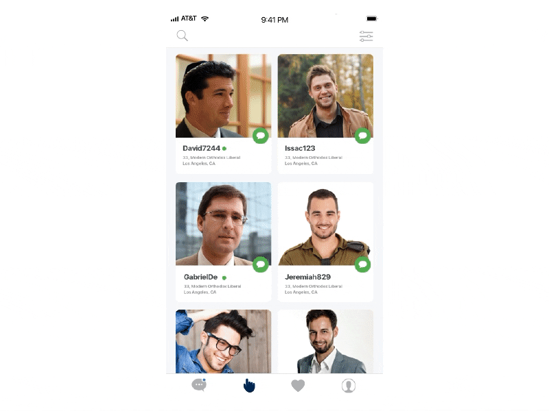
- Complex navigation hindering profile setup and match discovery.
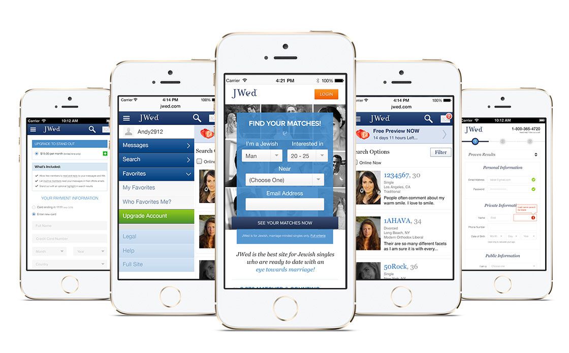
- Inconsistent branding across app and email communications.
- Low engagement rates with existing email campaigns.
Research Activities:
- Conducted user interviews to understand onboarding challenges.
- Analyzed user behavior data to identify drop-off points.
- Reviewed competitor platforms to benchmark best practices in dating app UX and email marketing.
Ideation & Iteration
Concept Development:
- Developed wireframes focusing on intuitive navigation and streamlined onboarding.
- Created prototypes to test new layouts and gather user feedback.
Design Decisions:
- Implemented a modular design system to ensure consistency across app screens.
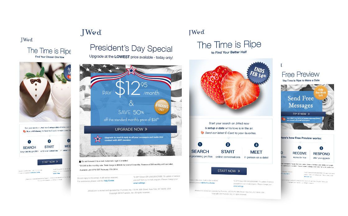
- Introduced personalized email templates to increase user engagement.
- Optimized call-to-action placements to guide users through the matchmaking process.
Visual Design & Systems
Typography & Color:
- Selected clean, sans-serif fonts for readability and modern appeal.
- Utilized a color palette that reflects the brand’s identity and evokes trust.
Layout Logic:
- Adopted a grid-based layout to ensure consistency and scalability across devices.
- Prioritized mobile responsiveness to cater to a broader audience.
Visual Tone:
- Balanced professionalism with warmth to resonate with users seeking meaningful relationships.

Outcome & Reflection
Outcome:
- Achieved a significant increase in user engagement and time spent on the platform.
- Improved email open and click-through rates through targeted campaigns.
- Enhanced brand consistency across digital touchpoints, reinforcing JWed’s position in the market.
Reflection:
This project underscored the importance of aligning design strategies with user needs and business objectives. By focusing on user-centric design principles and data-driven decision-making, we were able to create an experience that fosters genuine connections among users.

Ready to start a project?
I’d love to hear more. Tell me a bit about yourself, and I’ll be in touch with you shortly.
More projects


