Peninsula Dance Academy
Crafted visually refined performance posters for a ballet company, translating the grace and fluidity of classical dance into elegant print design. Focused on expressive imagery, balanced composition, and typographic hierarchy to capture attention and convey artistic sophistication. Maintained brand consistency while enhancing audience engagement and promoting seasonal performances with clarity and emotional resonance.
The Challenge
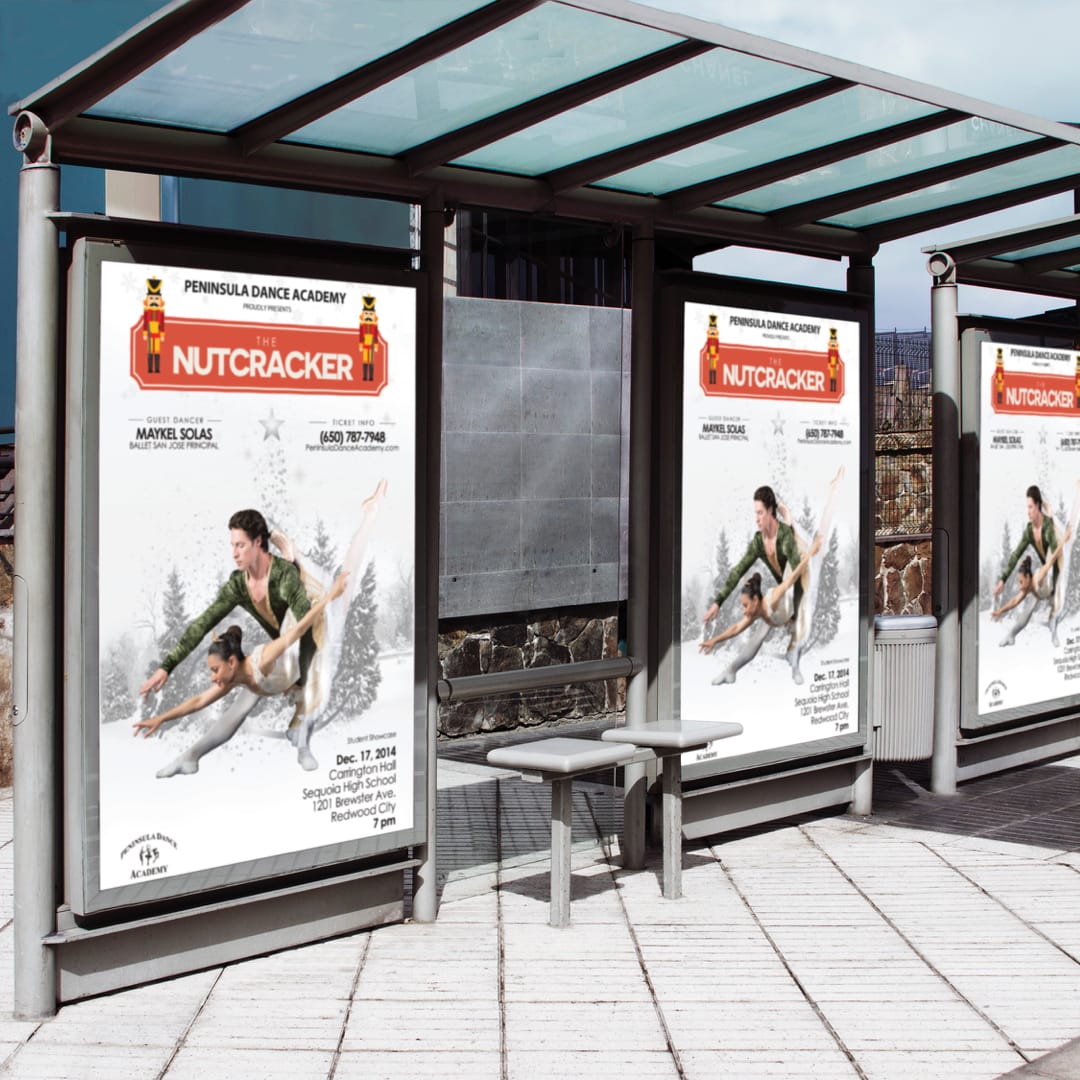
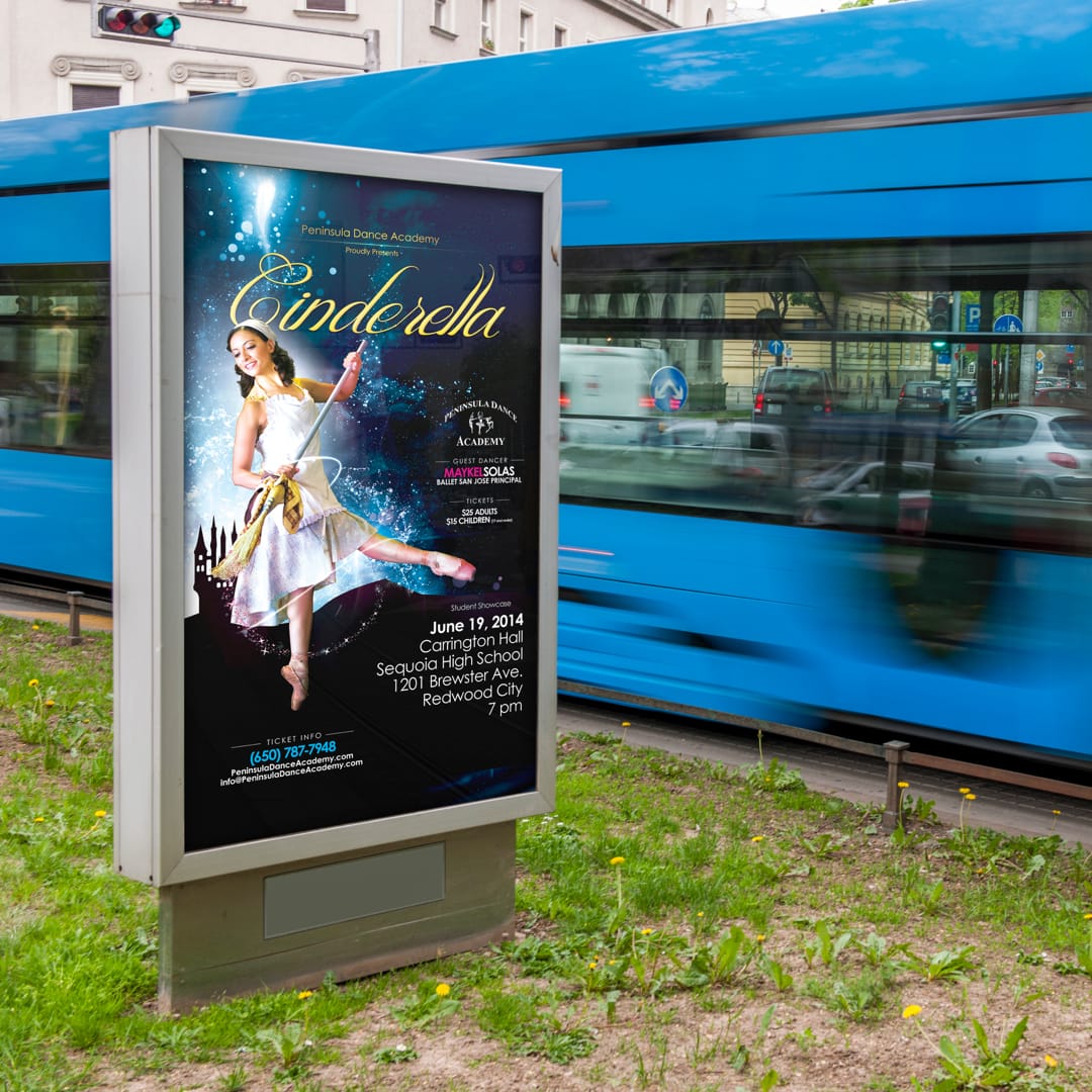
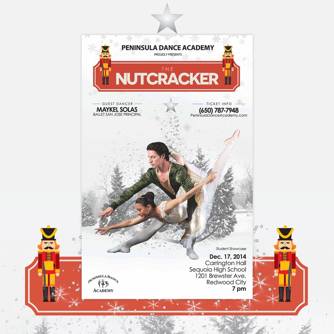
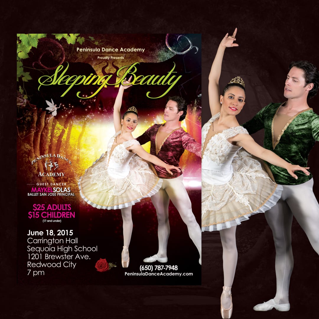
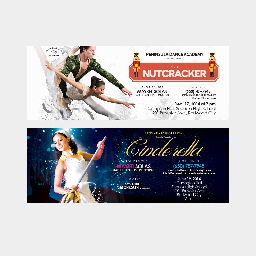
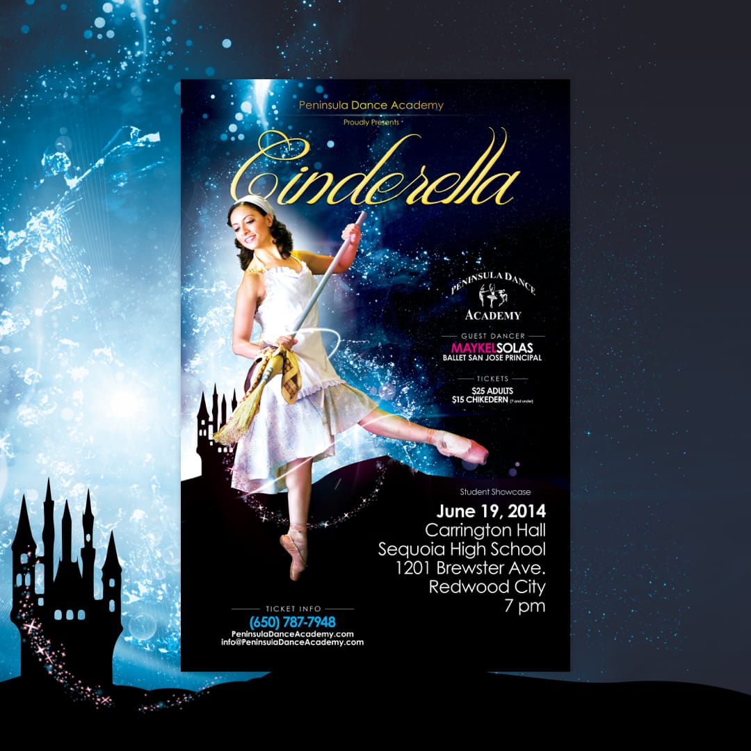
Peninsula Dance Academy, a ballet studio adhering to the Vaganova technique, sought to promote its seasonal performances, including the annual Nutcracker and spring showcases. The objective was to create visually captivating posters that encapsulated the grace and artistry of ballet while maintaining brand consistency.
Discovery & Research
Business Objectives:
- Increase attendance at seasonal performances.
- Enhance brand visibility within the local community.
- Reflect the academy’s commitment to classical ballet training.
Research Activities:
- Analyzed previous promotional materials to identify areas for improvement.
- Studied visual trends in ballet performance advertising.
- Collaborated with the academy’s directors to understand the thematic essence of each performance.
Ideation & Iteration
Concept Development:
- Developed mood boards to establish a visual direction aligning with the elegance of ballet.
- Created initial sketches and layouts for poster designs.
Design Decisions:
- Selected a refined color palette and elegant typography to convey sophistication.
- Incorporated high-quality imagery of dancers to capture movement and emotion.
- Ensured that all materials maintained brand consistency across various platforms.
Visual Design & Systems
Typography & Color:
- Utilized serif fonts to evoke elegance and professionalism.
- Employed a neutral color scheme with accents to highlight key information.
Layout Logic:
- Adopted a clean, grid-based layout to ensure readability and visual appeal.
- Balanced text and imagery to guide the viewer’s eye through the content.
Visual Tone:
- Maintained a refined and inviting aesthetic to resonate with the target audience.
Outcome & Reflection
Outcome:
- Successfully launched a series of print posters that increased attendance at performances.
- Received positive feedback from the academy and attendees regarding the visual appeal and clarity of the materials.
- Enhanced the academy’s brand presence within the local community.
Reflection:
This project highlighted the importance of cohesive branding and visual storytelling in promoting performing arts events. By focusing on elegance and clarity, we effectively communicated the essence of Peninsula Dance Academy’s performances.
Ready to start a project?
I’d love to hear more. Tell me a bit about yourself, and I’ll be in touch with you shortly.
More projects


