Job Posting eBook
Improved the user experience and content engagement of a digital eBook designed to help employers write more effective job postings. Developed a visual system that combined brand-aligned illustrations, accessible layout structure, and clear information hierarchy. Focused on visual storytelling and readability to create a seamless educational journey that increased retention and reinforced the client’s authority as a trusted hiring resource.
The Challenge
The client aimed to provide employers with a comprehensive guide to crafting effective job postings. The objective was to design an eBook that not only conveyed the information clearly but also engaged readers through compelling visuals and intuitive layout.
Discovery & Research
User Pain Points Identified:
- Dense text making it difficult to extract key information.
- Lack of visual elements leading to decreased engagement.
- Inconsistent branding affecting credibility.
Research Activities:
- Analyzed existing employer guides to identify common design pitfalls.
- Reviewed best practices in eBook design and visual storytelling .
- Collaborated with the content team to understand the core messages and objectives.
Ideation & Iteration
Concept Development:
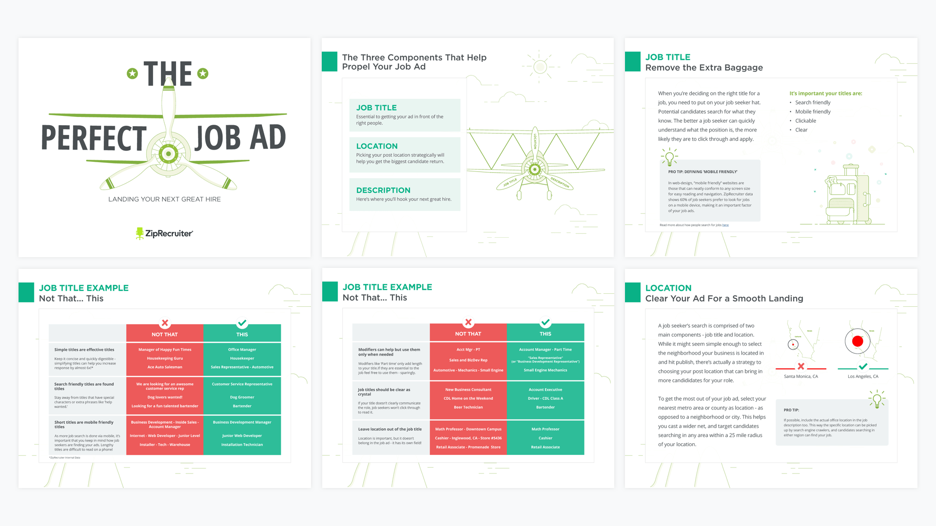
- Developed wireframes focusing on readability and visual hierarchy.
- Created mood boards to establish a cohesive visual style aligned with the client’s brand.
Design Decisions:
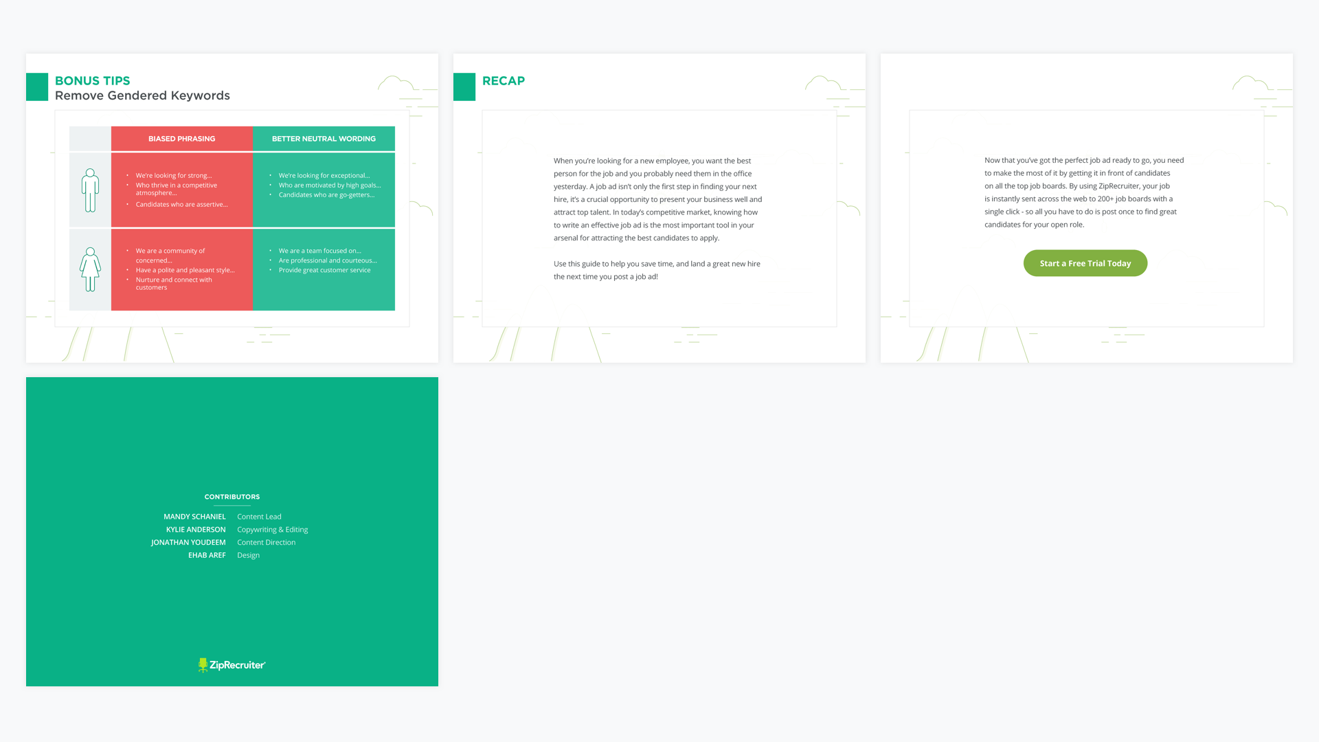
- Incorporated custom illustrations to simplify complex concepts and enhance engagement.
- Utilized consistent color schemes and typography to reinforce brand identity.
- Implemented interactive elements, such as clickable sections, to improve navigation.
Visual Design & Systems
Typography & Color:
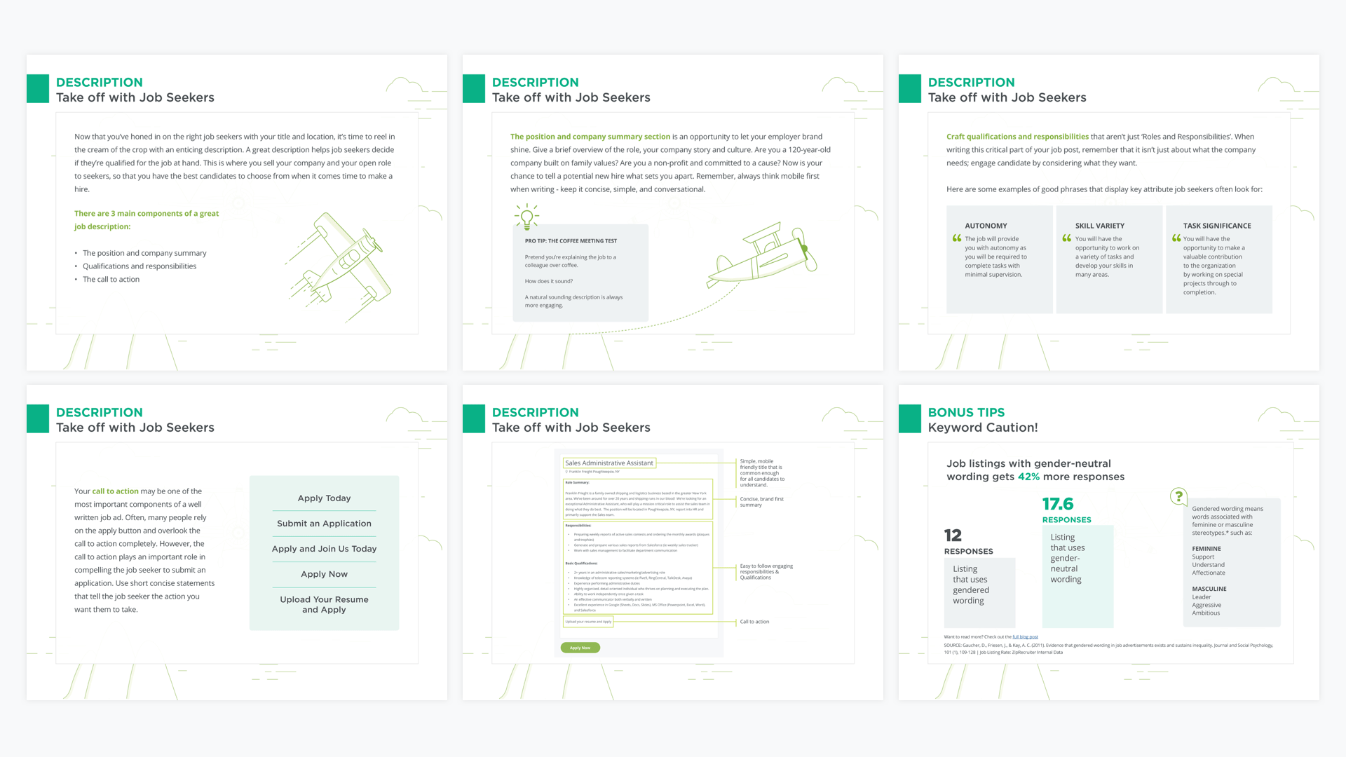
- Selected clean, sans-serif fonts for optimal readability across devices.
- Applied a color palette that reflects the client’s branding, ensuring visual consistency.
Layout Logic:
- Adopted a grid-based layout to maintain structure and balance between text and visuals.
- Emphasized key takeaways through callout boxes and highlighted sections.
Visual Tone:
- Balanced professionalism with approachability to resonate with a broad employer audience.
Outcome & Reflection
Outcome:
- Successfully launched the eBook, receiving positive feedback for its clarity and visual appeal.
- Increased user engagement metrics, including time spent on the page and download rates.
- Enhanced the client’s brand perception as a thought leader in employer resources.
Reflection:
This project underscored the importance of visual storytelling in educational materials. By integrating design principles with informative content, we created a resource that is both functional and engaging, ultimately aiding employers in improving their job postings.
Ready to start a project?
I’d love to hear more. Tell me a bit about yourself, and I’ll be in touch with you shortly.
