Semantic Typography Poster Exercise
A self-initiated exploration of how typography can function as both content and form. This poster study investigates the expressive potential of letterforms, spacing, and composition to communicate emotion, establish hierarchy, and craft visual rhythm—without relying on imagery. The project highlights how thoughtful typographic decisions can turn language into an immersive visual experience.
The Challenge
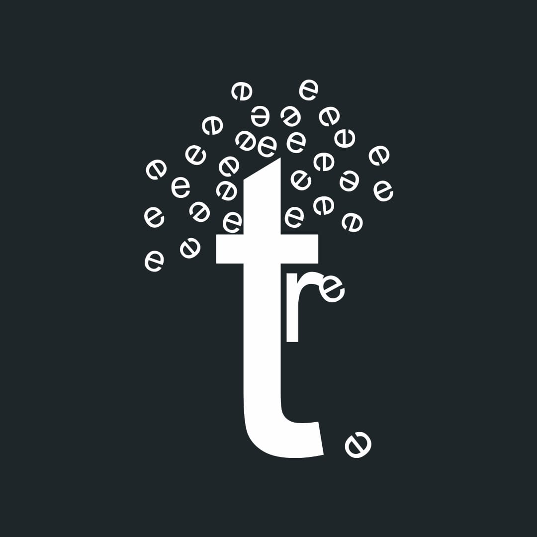
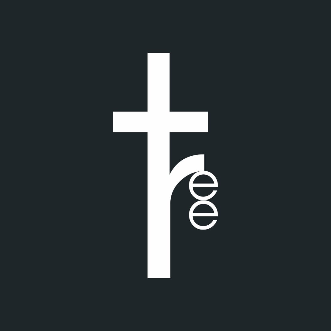
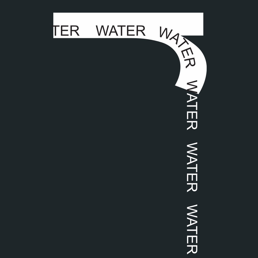
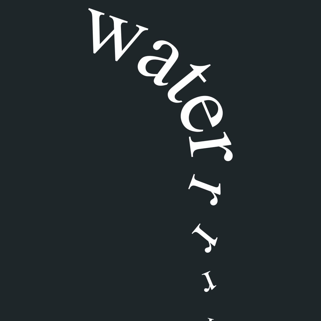
This self-initiated project aimed to investigate how typography alone can convey meaning, emotion, and hierarchy without relying on imagery. The objective was to create a poster that communicates a message purely through the manipulation of letterforms, spacing, and composition.
Discovery & Research
Objectives:
- Explore the expressive potential of typography.
- Understand how typographic elements influence perception.
- Develop a visual narrative using only type.
Research Activities:
- Studied works by typographic pioneers such as Josef Müller-Brockmann and Ladislav Sutnar.
- Analyzed contemporary typographic posters for inspiration.
- Experimented with various typefaces to observe their emotional impact.


Ideation & Iteration
Concept Development:
- Created initial sketches focusing on different typographic treatments.
- Explored various compositions to achieve visual balance and emphasis.
Design Decisions:
- Selected a typeface that aligns with the intended emotional tone.
- Manipulated kerning, leading, and scale to create rhythm and hierarchy.
- Utilized negative space strategically to enhance readability and focus.
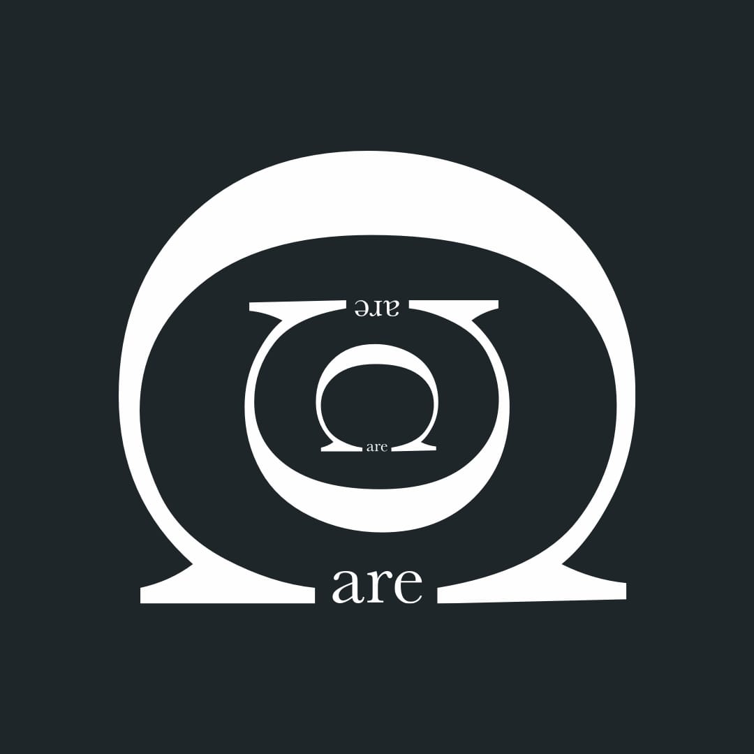
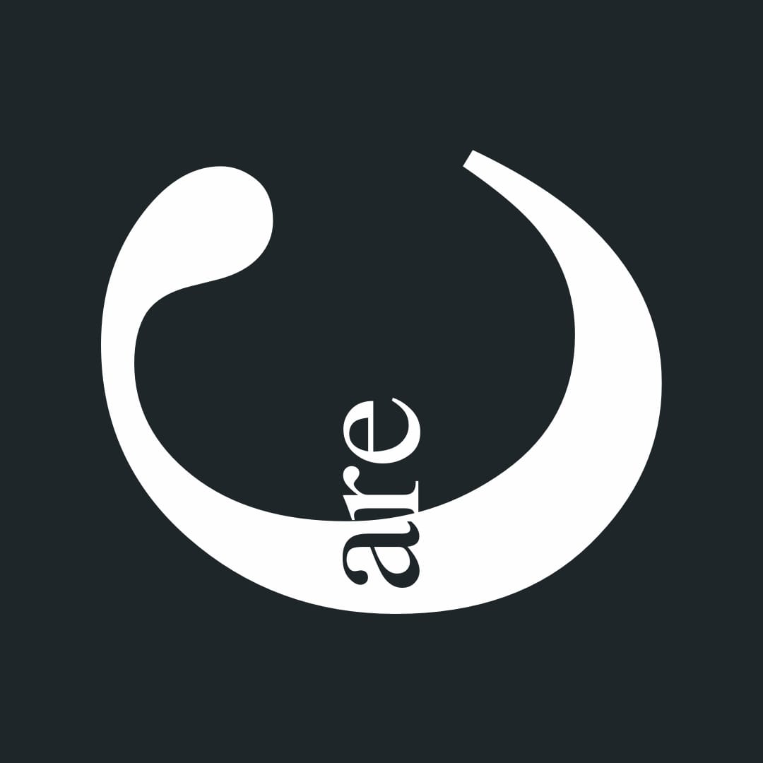
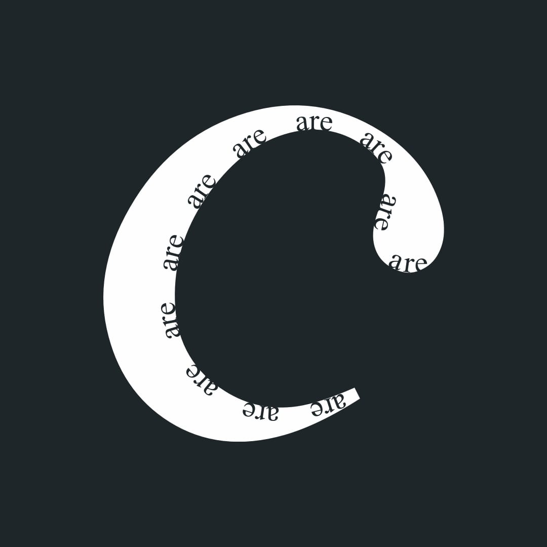
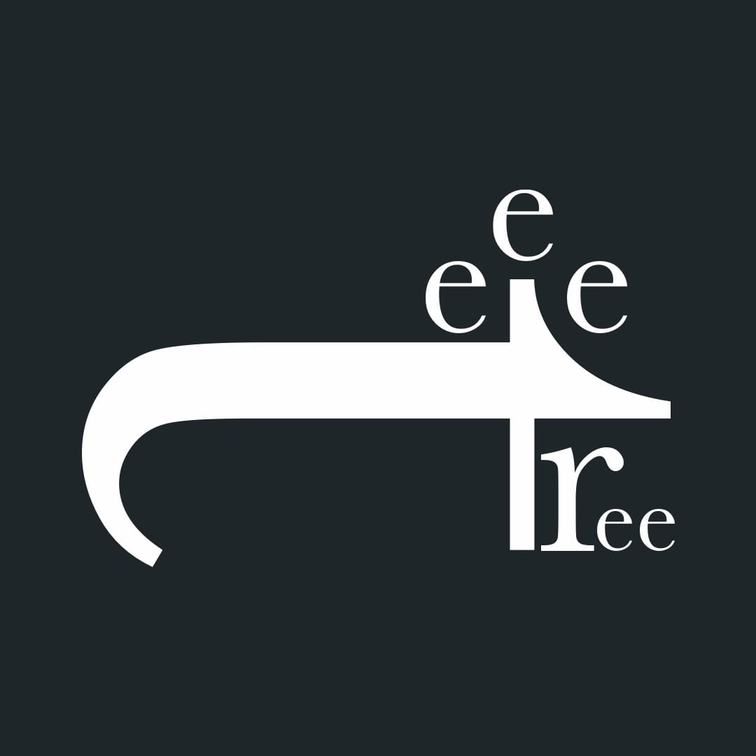
Visual Design & Systems
Typography & Color:
- Employed a monochromatic color scheme to maintain focus on typographic elements.
- Used bold and light weights to differentiate between primary and secondary information.
Layout Logic:
- Implemented a grid system to ensure structural coherence.
- Balanced asymmetrical elements to create dynamic tension.
Visual Tone:
- Aimed for a minimalist aesthetic to allow the typography to take center stage.

Outcome & Reflection
Outcome:
- Produced a typographic poster that effectively communicates a message without imagery.
- Enhanced understanding of how typographic choices affect visual communication.
- Developed a deeper appreciation for the nuances of type in design.
Reflection:
This exercise reinforced the power of typography as a standalone visual language. By focusing solely on type, I was able to explore its capacity to convey complex ideas and emotions, further honing my skills in visual storytelling and design decision-making.
Ready to start a project?
I’d love to hear more. Tell me a bit about yourself, and I’ll be in touch with you shortly.
More projects


